Sebastian

From February to March 2019, I took part in Springboard's UX Design course. I applied the concepts and skills that I learned to a capstone project that took me through the entire UX design process from start to finish.

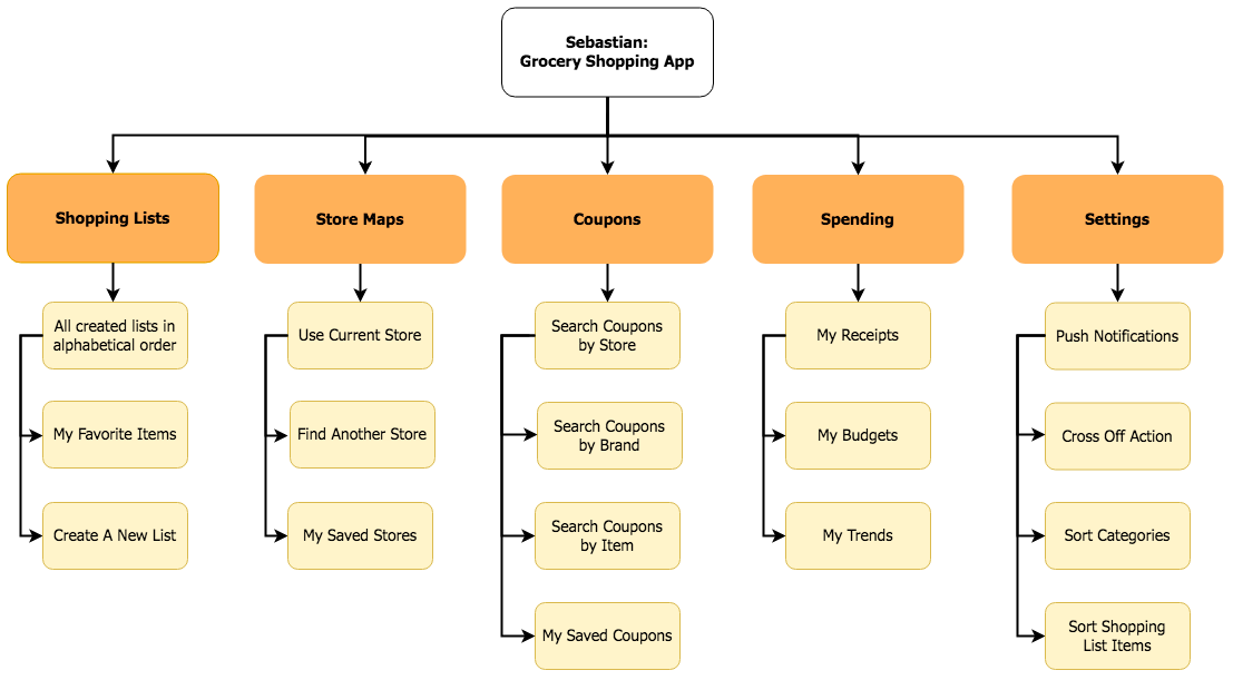
The end product was Sebastian, a mobile app designed from scratch to help shoppers better navigate grocery stores.

Img

The Problem

Grocery stores are:

Massive

Most grocery stores come in at approximately 45,000 square feet — that's not too far off from the size of the White House.

Overwhelming

The average grocery store has over 40,000 skus and are strategically designed to make shoppers spend more than they intended.

Time-Consuming

Americans typically spend 43 minutes per trip — excluding travel time. At 1.5 average trips per week, that's 2.5 days at the grocery store every year!

Unenjoyable

From poor customer service to congested aisles and long check-out lines, it's no surprise people are turning to online grocery shopping.

User Research

User research is the first, and arguably the most important, step of the UX design process. Understanding our users' needs, behaviors, thoughts and environments will help ensure we are designing the right product in the right way for the right people.

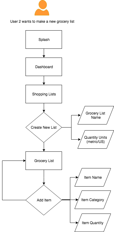
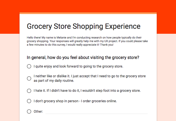
What I really wanted to tap into was how Americans currently do their grocery shopping and what (if anything) they would like to improve about their overall experience. So I created a screener survey to gather primary research that could validate the hypothesis that a dedicated grocery list app would indeed be useful.

In addition, I further interviewed 3 individuals who completed the screener to dig a bit deeper into what pain points a potential grocery shopping app could help alleviate.

Some of the key findings from the surveys and 30-minute interviews include:

  • Approximately 75% of people use something to keep track of what they need to buy at the grocery store. While most people simply use “Notes” on their cell phone, others use apps like Gkeep and Wunderlist.
  • Over 50% of people prefer to find items on their own. This is coupled by the fact that the majority of people find service to be poor or lacking in most grocery stores, excluding Trader Joe’s.
  • Around 90% remember their way around their local grocery stores, which is much higher than predicted. And store layout changes do not occur as often as I assumed. However, even if users are familiar with their store layout, an app that shows a map of a grocery store would still be helpful in A) an unfamiliar grocery store or B) a familiar grocery store when users are looking for a product they don’t normally purchase.
  • Over 50% of grocery shoppers never use coupons. But they did state that they were open to using digital coupons. Many people mentioned that saving money at the grocery store was a goal they wanted to work on.
  • Around 30% of people enjoy grocery shopping, while 66% would say they neither like or dislike it. This seems pretty accurate, as I interviewed 3 people and only 1 person said they really enjoyed grocery shopping.

To view the full summary of results and insights collected from the screeners and interviews, please click here.

Overall, I would say there is definitely room for improvement when it comes to helping people have a more positive and seamless grocery shopping experience. The survey validated the hypothesis that there is a market for an app dedicated to helping people keep track of their grocery list. In addition, the research emphasized two other recurring pain points that my app could also solve: how to save money and how to save time at the grocery store.

Personas

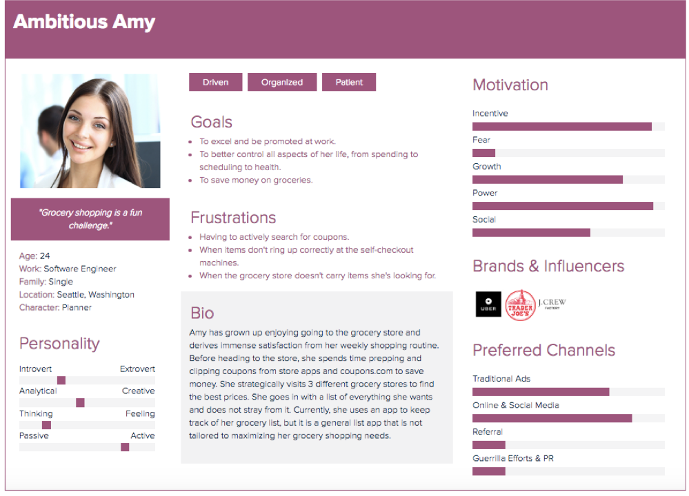
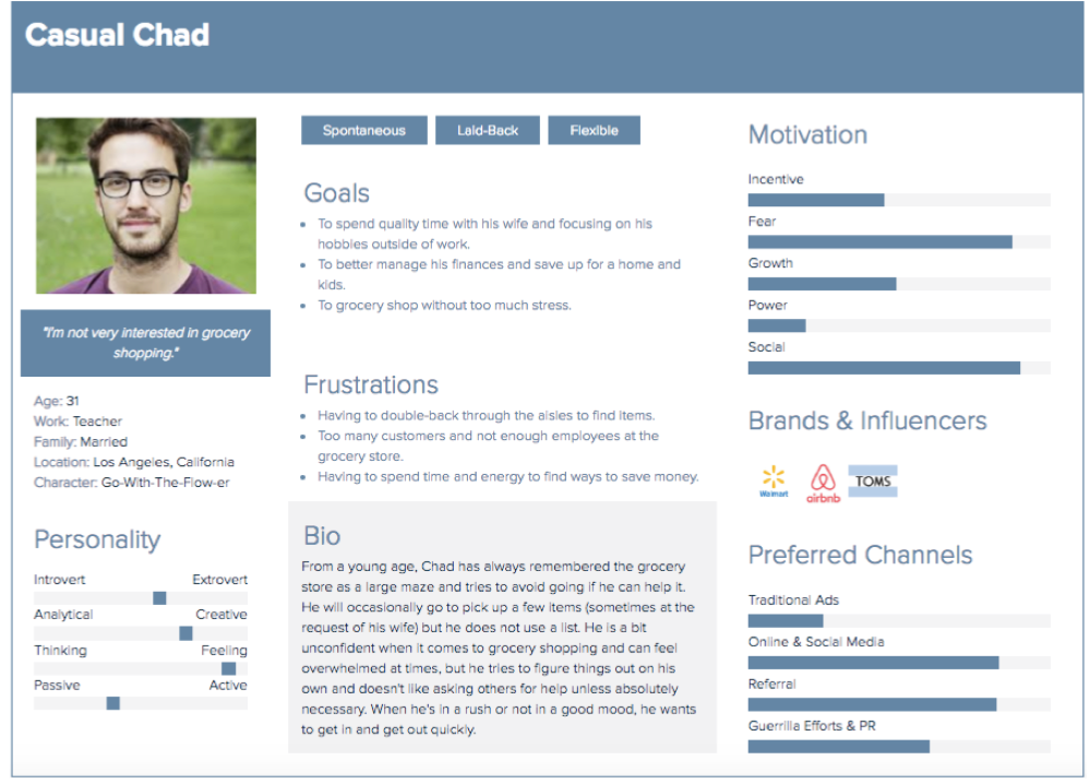
I created personas and empathy maps to help better paint a picture of who my potential users are. Personas are a representation of a type of user, and there were two main user types uncovered during the research process: Ambitious Amy and Casual Chad.
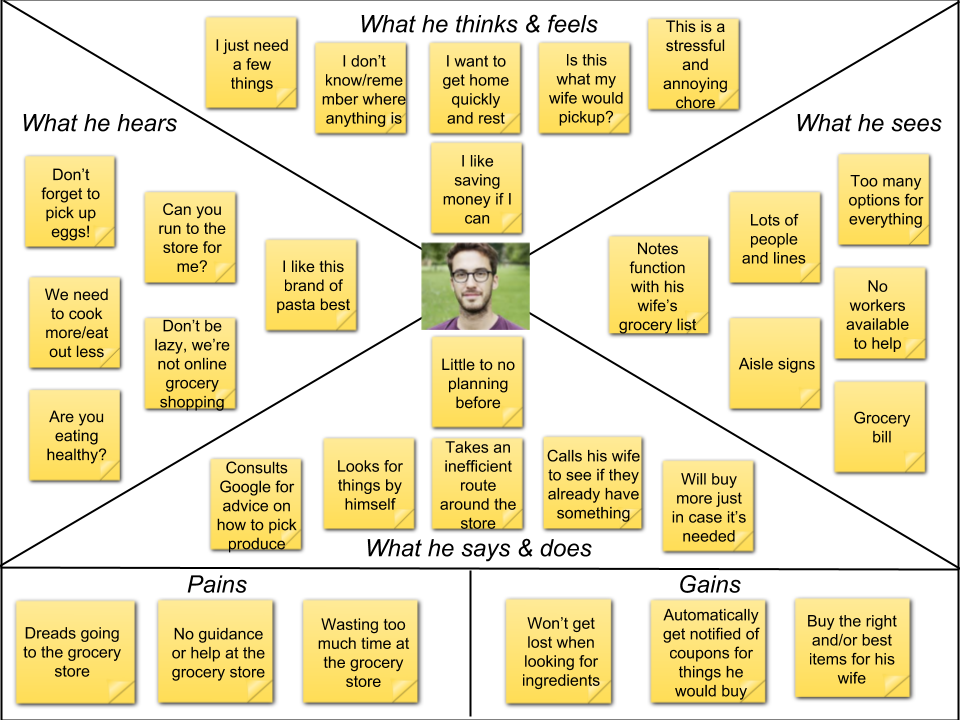
Img
Img

Empathy Maps

Img
Img

Competitive Analysis

I conducted a usability heuristic analysis, comparing 3 competitor grocery list apps. It was important to understand what each of their strengths and weaknesses were, and to identify common usability problems that I could avoid in my own app design. In addition, it was apparent that these apps lacked coupon clipping and spend tracking features that Ambitious Amy would appreciate, and lacked grocery store maps and shopping routes that Casual Chad would be inclined to use.

  • ShopList

  • OurGroceries

  • AnyList

User stories

Keeping the needs of Ambitious Amy and Casual Chad in mind, I wrote out user stories (which are sentences to describe a simple description of a requirement) to eliminate feature creep and ensure the Minimum Viable Product (MVP) is well thought-out.

Img

Sitemap

The next step was to organize how the app's content and functionality would be structured with a sitemap.

Img

User Flows

Before designing the app, it was also helpful to create user flows, which showed the step-by-step elements required to allow a user to perform a particular task. Below are two example user flows.

Img Img

Wireframing

A wireframe is a visual representation of a user interface that gives a sense of how the elements will be placed together on the page. As the first step of the design phase, creating the wireframes was more time-consuming and difficult than I originally thought. I preferred using Balsamiq over sketching by hand to create the low-fidelity wireframes, as it allowed me to move and edit different components of each screen very quickly.

It was easier for me to tackle the wireframes when I broke down step-by-step how users would complete different tasks. The tasks that I focused on creating screens for were:

  • Signing up and logging in
  • Searching for coupons
  • Using a store map and locating a particular item in that store
  • Creating a new grocery list and adding an item to the list
Img

I also decided to sketch out the core features of the “Spending” menu as this was a key differentiating feature that Ambitious Amy would find useful. This included the My Receipts, My Budgets and My Trends screens.

A couple of things that I had to consider when making the wireframes included:

  1. What constituted needing a full dedicated screen and what could I get away with using a modal window. For example, the modal window worked well for adding new items to the grocery list.
  2. Whenever a screen felt too empty, I considered combining that screen with another one to streamline the process for users. On the other hand, when a screen was looking too busy, I had to be deliberate in deciding what was actually necessary and what was superfluous.

Prototype

After all the wireframes were created, the next step was to create a working and clickable prototype.

Utilizing the low-fidelity wireframes that I created in Balsamiq, I exported each of the individual wireframes as png files and brought the prototype to life using InVision.

Img

While I was working on the prototype and creating the hotspots where users would be able to click through the app wireframes, I realized I was missing a couple of key components. For example, I didn't add any “back” buttons, making it impossible for my users to toggle between screens. It was good that this was caught early on as making edits and changes later in the development process would be extremely time-consuming (and costly for UX projects in the real world).

Logo

The working name for the app was "Shopping Buddy", but that sounded a bit impersonal and generic. The final name Sebastian was derived from the initials of Shopping Buddy "SB". When it came to the logo, the first thing that came to mind was man's best friend, a trusty companion riding in your shopping cart to make your grocery run just a little bit more enjoyable. What I love most about the image is how fun and full of life it is.

Img

Style Guide

Working off of the orange from the logo, I created a color palette and style guide for the app for a unified look and feel.

Img

Research Evaluation

After the prototype was completed, I put it to the test with four participants. Overall, the testings went well. All participants completed a sample set of tasks and recorded any feedback or difficulties they encountered.

The most common feedback mentioned that would need to be addressed in future iterations were:

  • They preferred to immediately search for coupons using a search bar, without needing to specify the coupon type on the prior page.
  • The ability to change from imperial to metric should be in Settings, instead of asking users to specify this with each new list creation.
  • In general, there too many buttons to click through to get to certain pages in the app and the process could be more streamlined.

Conclusion

This was an extremely interesting and educational project to complete. There are many similarities between UX Design and marketing, as both are very user- and customer-centric. With the rise of digital marketing in particular, you really can't have one without the other — they must co-exist; effective marketing will send customers to the UX but if the UX is not creating the right kind of brand experience for the users, customer retention and loyalty will suffer. Both UX design and marketing require constant research, testing and iterating in order to attract and keep consumers engaged.